Compensation professionals are constantly examining the distribution of data – e.g., the distribution of salaries, salary increment, bonus payouts, etc. While they typically focus on quartiles and medians of the distribution, they recognize that they need to look at the entire distribution to truly understand the data in question and recommend the right decisions.
The box plot is one of the most widely used devices for examining and comparing data distributions. Mostly they rely on excel for data analysis, however, the vast majority of compensation professionals have not been exposed box plots (to which excel does not offer the box plots in its graph portfolio) and their usefulness. This post attempts to persuade the human capital analysts to consider introducing box plots into their analyses and presentations.
WHAT IS BOX PLOT??
Box plots are an excellent tool for conveying location and variation information in data sets, particularly for detecting and illustrating location and variation changes between different groups of data.
The important features of any data distribution are the variation of data and their clustering, if any, around certain values. The variation is characterized by the range of data as determined by the minimum and maximum values. If the clustering typically occurs around one value, this is the central tendency of the data. The other important feature is the spread – the degree to which the data cluster around the central tendency. If there is only a little clustering, the data have a large spread.
Box plots are formed by:
· Vertical axis: Response variable
· Horizontal axis: The factor of interest
The statistical box plot has two additional features. The first, is to show the average or mean of the distribution in the box. The second is to characterize some observations as outliers.
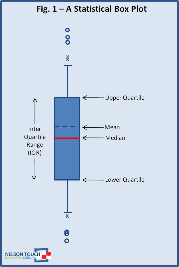
The inter-quartile range is the distance between the upper and lower quartiles and contains (by definition) 50% of the data points around to the median. The average, denoted by a dashed line, completes the picture of the data distribution. Compensation professionals rely more on the median, since it is a measure of central tendency that is not influenced by outliers.
It is important to identify data points that are far from the median. These may or may not be relevant to the analysis. When looking at salaries, for example, a person with an extremely high or low salary may be a special case and therefore outside the scope of the analysis. In general, the focus of any analysis is where the bulk of the data are – those data points within the IQR.
The IQR is used as a metric to denote two ranges of data:
· The “inner fence” is 1.5 times the IQR beyond the lower and upper quartiles (i.e., beyond the box).
· The “outer fence” extends 1.5 times the IQR beyond the inner fence (i.e., 3 times the IQR beyond the box).

These ranges allow us to classify data points beyond the IQR as “outliers” or “extremes.”
An outlier is any data point that is beyond the inner fence but within the outer fence. Outliers are denoted by an “x” symbol. An extreme is any data point that lies beyond the outer fence. Extreme values are denoted by an “o” symbol.

In the statistical box plot, the lines extend to next data point outside the box. If there is no data point within the inner fence, then the line extends to the inner fence (there can still be outlier or extreme data points).
The box plot portrays the data distribution in a simple graphic that displays all its important feature.
|

eg: Comparing the base salary
|


For small data sets, the analyst can typically get a sense of the distribution by looking at the column of numbers (sorting them in ascending or descending order helps a lot). However, for large data sets, we require the need to plot a histogram.
Anusha Pant
HR - Group 1
No comments:
Post a Comment