
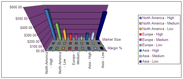
There are a lot of obvious problems with these types of charts: The dimensions have different scales and it is therefore impossible to decipher. I could not, would not make a decision based on this chart. The other option is to break this out into multiple charts. But that requires a lot of space – and space is tight in a good dashboard. Analyzing numbers would also be more difficult in that setup as we have to shift our view from one chart to the next.
THE CASE FOR BUBBLES
There is a better way to display this type of data. Bubble charts allow us to visualize three different measures at the same time. And not only that: they are easy to read and they allow us to make critical associations between these measures. Let’s have a look at an example: This is a classic bubble chart that displays three different measures: Late shipments, damaged shipments and shipping cost for different carriers. The first two measures are obvious – they are represented by the x and y axis. The shipping costs, however, are visualized via the size of the bubble.

Chart 2 - A classic bubble chart
Notice how easy it is to read this chart (which vendor has the best performance?). Depending on the problem that I am trying to solve, I could simple look at the top right area to find the black sheep that are super later and also careless. Or, I could first focus on the size of business that we do with each carrier by picking out the large bubbles. Also notice how this chart allows me to combine three measures with different types scales: percentages and absolute values. The traditional 3D bar chart was useless.
THERE IS MORE
This is useful if you want to categorize your data a little further by using a common layout like it is used in a SWOT or market attractiveness analysis. Take a look at the bubble chart that we created using the data from the first Excel 3D example:

Chart 3 - A quadrant bubble chart
This puts the data into further context and makes it really easy for managers to spot specific key points. For example, the attractive markets (high margin & high market share) are up in the right upper corner.

Chart 4 - Use your mouse to explore
LAST BUT NOT LEAST
One person who has really popularized the bubble charts is scientist Hans Rosling. He literally makes data fly. If you haven’t done so, make sure to watch one of his famous TED presentations.
Take a look at bubble charts! Consider them for your next project. They are easy to understand and they allow us to make critical associations. Chances are managers who have attended business school will certainly like them. A friend of mine always says that managers are like kids. And kids like bubbles, right?
References: http://www.performance-ideas.com/2011/04/05/bubble_charts_cognos/
Author: Pratik Pawar
Roll No: 13027
Group: Marketing - Group 4
No comments:
Post a Comment